
July 5, 2013 07:10 by
 Scott
Scott
MVC 4 introduces many new features. In today post, I will talk about MVC 4 and enhanced default templates.
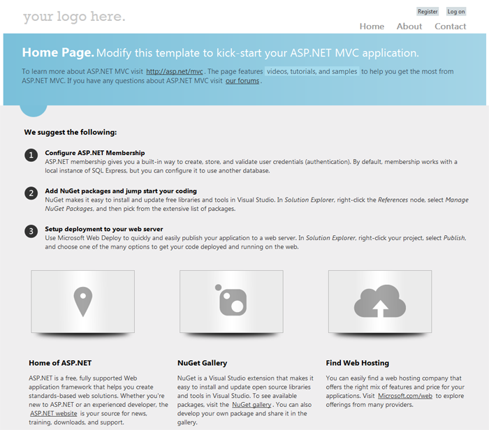
When you create a new project, the default website looks quite different from previous versions. Besides the improved aesthetics, the default website has improved functionality thanks to a technique called adaptive rendering.
Adaptive rendering is where the page is rendered specific to the browser without any customization. This is an absolute must for most developers today; write once, run everywhere. The adaptive rendering is made possible thanks to a new CSS type -> media queries
@media all and (min-width: 640px) { #media-queries-1 { background-color: #0f0; } }
@media screen and (max-width: 2000px) { #media-queries-2 { background-color: #0f0; } }
After you creating a new website, you’ll be able to see the improvements in the default layout.
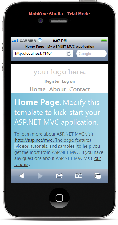
To see the adaptive rendering in action, open the page using a mobile device.
Here’s how the page looks on an iPhone.
And here’s how the page look on an iPad.
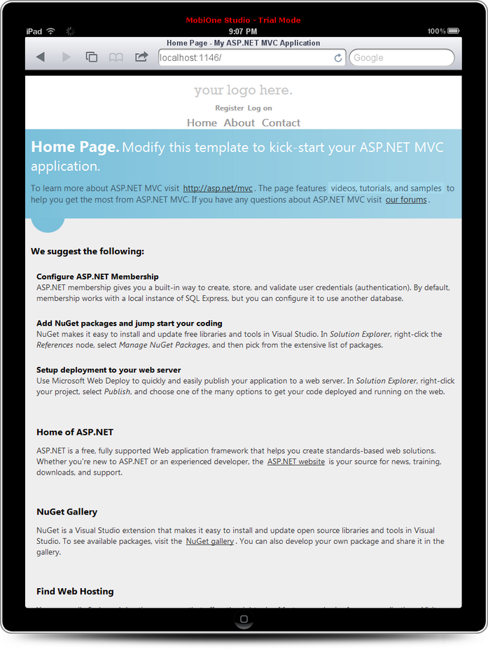
The page renders differently depending on the size of the screen. Making the page do that without media queries is tricky. Using media queries makes it simple.
One final thing to note is the default template takes advantage of jQuery UI also. The Login and Register links show you how to use this JavaScript library to provide a richer UI. You can read all about the other features that are available to you with jQuery UI here.
Testing with Emulators
The best way I found to test what the site will look like is with FireFox and User Agent Switcher add-on,
which changes the user agent that’s sent to the browser. That can be downloaded
here.